1 UI DESIGN SYSTEM - CASE STUDY

1 UI DESIGN SYSTEM - CASE STUDY
This case study demonstrates how the design team lead developed a design system for the organization. Additionally, we identified experience gaps and created a design system that ensures consistency across all engineering, design teams, and products.
My role
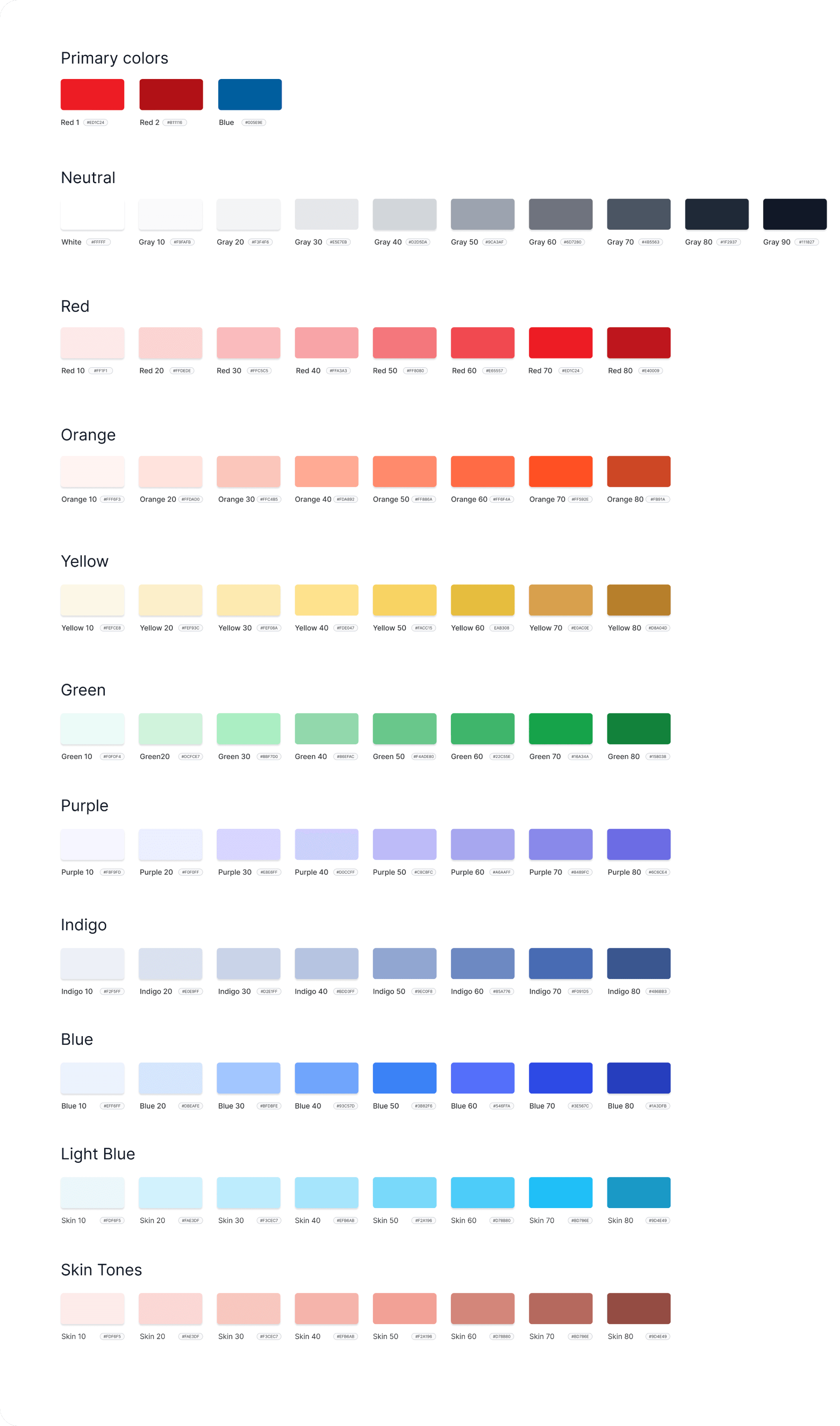
I collaborated closely with a talented team to ensure a cohesive and visually appealing user experience. My key responsibilities included developing themes, selecting color palettes, designing form styles, and creating illustrations and visual icons. Together, we crafted a comprehensive design system that enhances consistency and usability across all our products.
Design system purpose
We built a design system to create a consistent look and feel for all our products, ensuring users have a smooth and familiar experience. This system helps our design and development teams work more efficiently by providing standard themes, colors, form styles, illustrations, and icons. It also makes it easier to keep our brand's visual identity strong. Overall, the design system helps us deliver better and more cohesive products for our users.
Principles
Consistency: Ensuring uniformity across all components and interfaces.
Scalability: Designing elements to adapt and grow with future needs.
Clarity: Prioritizing clear and intuitive design elements for easy user interaction.
Modularity: Building independent, reusable components.
Accessibility: Making designs usable for people with varying abilities.
Flexibility: Allowing customization while maintaining overall coherence.
Efficiency: Streamlining design and development processes.
Visual Hierarchy: Establishing clear priorities to guide user attention.
Alignment: Ensuring elements are properly aligned for a clean, organised look.
Documentation: Creating comprehensive guidelines for consistent implementation.
Design system
The process
I started building the design system by researching and planning to understand user needs, business goals, and technical constraints. I established core principles and standards for typography, color schemes, and spacing. First, I created the basic design elements like buttons and icons. I made all of the icons and visual icons from scratch as shown below. Then, I combined these into more complex components like form fields and navigation menus. These were assembled into larger UI sections such as headers and footers. I designed templates to define overall layouts and used them to build actual pages. I documented everything clearly to ensure consistency and usability. I tested the system thoroughly, gathering feedback from users and stakeholders for improvements.
Icons
Visual Icons


Documentation and guidelines
For the design system, comprehensive documentation and guidelines were created to ensure consistency and usability. This included clear descriptions of each component, from basic elements like buttons and icons to larger structures like headers and footers. Accessibility considerations were also included to make sure everything was usable by everyone. This documentation served as a valuable resource, helping designers and developers maintain uniformity across all projects.


Success page templates
Result
The design system made all projects more consistent and user-friendly. It saved time and reduced mistakes, leading to faster product launches and better user experiences. This increased customer satisfaction and engagement
Conclusion and learning
Building the design system taught me the importance of consistency, clear documentation, and teamwork. It showed that a good design system improves user experience and speeds up the design process, leading to quicker product launches. Regular updates and user feedback are essential for ongoing improvement. Staying up-to-date with industry trends and keeping the design flexible are also crucial.
Thank You for Watching